First assignment
For this assignment we had to draw for different drawings one of a tree with a lens game and another one in animal the third one was one point perspective of a street and the fourth one was a hand drawing I thought the most difficult one was the hand drawing because I feel like didn’t come out as I thought it would but I think I could work on that but then overall I think everything else and all the other drawings came out very well. The good thing was that we had of the two days to finish this work.
Value Charts
We has to do a value chart of different ways u can use pen. The first was stippling,hatching,cross hatching, and invented. The one that took the longest to do was stippling because it was only don’t and to make it dark it was very hard and your hand got tired. Hatching was just line going across. Cross hatching was lines going horizontal and vertical. And invented was just what we wanted to do I did wavy lines going all the way.
100 squares
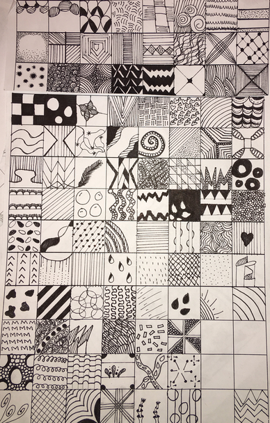
For this assignment we had to come up with 100 different pattern squares. It was hard to come up with that many patterns and each square had to be one different pattern sounds pretty difficult. But we were allowed to look up ideas but no copy. So it was easy but you always run out of ideas in the last 20 squares.
Landscape drawing
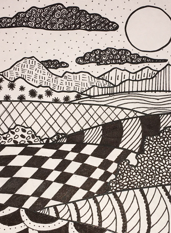
For this assignment we had to do patterns on a landscape drawing. We had to do light and darks and the patterns had to be different not the same. This helped me a lot with the project we are doing right now because it helped me with how to wrk and get the hang of how to use the patterns in darks and light areas.
Pen And Ink
I feel like this was a pretty difficult project to due I took over 2 weeks to finish this project but at the end of the day it came looking really good.
1. Describe how you arranged your composition. Discuss your use of the elements and principles. Is it a successful composition? The way I arranged my composition for my final drawing was by look at the picture from El Salvador. I felt like it was really hard to ding just the right patterns for everything on the picture that would give it and so the person looking at my drawing would understand what was going on. I think my drawing was successful because at the end it came out looking a little realistic.
2. How is texture and pattern are important in your composition?
Texture and pattern are important in my drawing because the patterns have a lot to due with the drawing for example I had a river I wasn’t going to use flowers I used waves and lines for it so it would look like a river. Texture is important because it makes the drawing look more realistic and better.
3. Why is value so important in this project?
Value was very important in this assignment because if we used one full shade of light the drawing would just like flat but if we used a mix of value from transitioning from light to dark the drawing wouldn’t look flat but 3D. And I feel like value is very important in a drawing because it gives the viewer a better understanding.
4. Describe your craftsmanship (How well the project is crafted technically).
I would say my project came out pretty well because I used many techniques we learned in class and how to use different patterns.
5. Explain how your knowledge and creating practice studies with value and pattern contributed to the success of your piece.
In class we learned many things that had to do with value and pattern I feel like that helped me a lot in this project because I was able to use that knowledge and put it in my drawing and I had a better understanding of how to use a range of value.
6. When applying the pen and ink/pattern techniques why and how is it important to make sure you understand the concepts taught in class?
I feel like it’s important to understand the concepts learned in class because they will help you throughout your drawing. The techniques learned in class you can put them in your drawing and it will better your drawing and make it look more realistic.
7. As a growing artist how do you think what you have learned will guide and better your future projects. Explain.
In the future I would add more detail to the drawings and try to not make them look as flat and more 3D style.
8. If you could recreate your piece what would you do differently to enhance your final outcome?
If I could recreate my project I would and my value to the back of the drawing and add a bit more of value throughout the drawing and add animals to both sides of my drawing.
Watercolor
I loved doing this project I just feel like I could have added more colors to make it look much better. But overall I really liked my painting.
1. Explain the process you had to use to create the poured watercolor painting.
I had to draw a picture of anything so I did sunflowers with a butterfly and that mask off what I wanted to keep white.
2. Describe any difficulties you had with this process.
The most difficult part to me was pouring the colors and being carful not to put to much color and water. And the body of the butterfly oh my that was the most difficult part for me because I added color and the body just fade away.
3. What were 4 things you learned from this project?
What I would do different I would change the colors of the background and the butterfly I feel like I could have added more light bright colors to it.
5. How did you use layers, textures, and color to create a successful piece?
Before I started to put and color on my paper I first put masking tape on the parts I wanted to keep the same color as the paper. And the flowers I feel like the colors came out so good.
6. Do you feel that the mini watercolor lessons were beneficial to you learning more about watercolor? Explain.
Yes, I feel like doing little assignments of watercolor helped me a lot because I had a better understanding of how watercolor works and it helped me for when the guest artist came.
7. Was having a guest artist a positive experience? Explain.
Yea because he taught me something I never heard of. And because it didn’t matter if the top of the paper looked ugly but when u would take the masking tape of it looked so pretty ñ.
8. What did you learn from the guest artist that gave you more insight into being a professional artist?
His drawing looked so good and the way he did it looked like it he didn’t care but it came out very good. And all you have to have is patience and the good thing about this technique is that it doesn’t matter if you mess up u can just add more water and color.
1. Explain the process you had to use to create the poured watercolor painting.
I had to draw a picture of anything so I did sunflowers with a butterfly and that mask off what I wanted to keep white.
2. Describe any difficulties you had with this process.
The most difficult part to me was pouring the colors and being carful not to put to much color and water. And the body of the butterfly oh my that was the most difficult part for me because I added color and the body just fade away.
3. What were 4 things you learned from this project?
- You have to be patient.
- You can always add more color and masking tape.
- And that the picture will never come out bad.
- I learned way much more of how I can use watercolor.
What I would do different I would change the colors of the background and the butterfly I feel like I could have added more light bright colors to it.
5. How did you use layers, textures, and color to create a successful piece?
Before I started to put and color on my paper I first put masking tape on the parts I wanted to keep the same color as the paper. And the flowers I feel like the colors came out so good.
6. Do you feel that the mini watercolor lessons were beneficial to you learning more about watercolor? Explain.
Yes, I feel like doing little assignments of watercolor helped me a lot because I had a better understanding of how watercolor works and it helped me for when the guest artist came.
7. Was having a guest artist a positive experience? Explain.
Yea because he taught me something I never heard of. And because it didn’t matter if the top of the paper looked ugly but when u would take the masking tape of it looked so pretty ñ.
8. What did you learn from the guest artist that gave you more insight into being a professional artist?
His drawing looked so good and the way he did it looked like it he didn’t care but it came out very good. And all you have to have is patience and the good thing about this technique is that it doesn’t matter if you mess up u can just add more water and color.
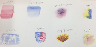
Watercolor Techniques
|
|
|
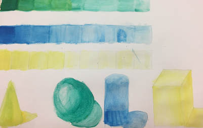
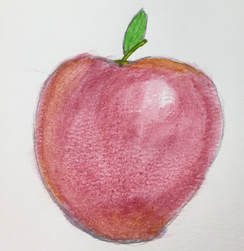
For this assignment we did different ways on how to use watercolor. And one of the ways I like the most was the wet on wet because all you have to do for that one is wet the paper a lot and then just add dots of color and it will spread. The one I didn’t like that much was the bleed because the colors really don’t blend well and it just looks like the colors are topped on one another. But over all I really liked using watercolor. We also did a drawing of an apple it was very hard but the hardest think to me was doing the dark areas because if I added more color the paper would keep pealing. We also did a chart of drakes to light and than we had to draw four different shapes. These practices helped me a lot with the final project.
Watercolor practice
For this assignment we did stippling. when we got the paper it looked like a lot of work and very hard. i found it easy because we did a practice before this and it was easy it just takes a lot of time and you have to be patient if your not it wont come out good it will just look like you drawed a bunch of lines and you don't want that. This sheet took me two days to do but at the end it turned out good.
Self-Portrait

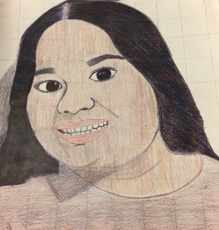
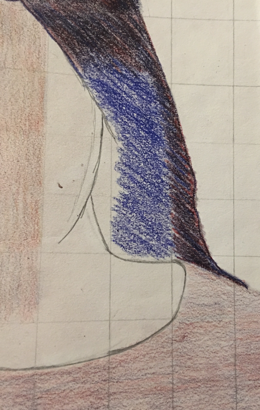
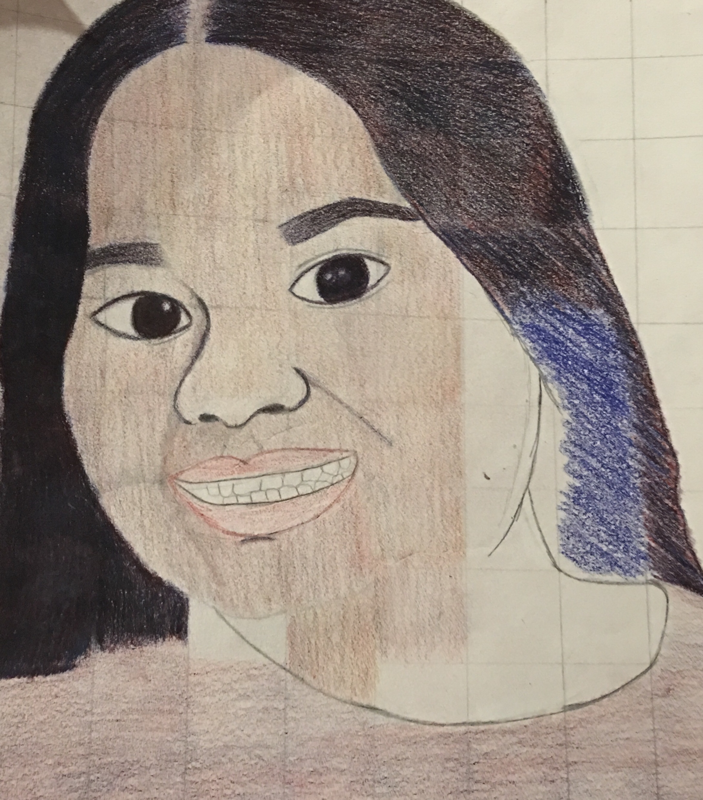
For this project we had to do a drawing of ourselves which was pretty hard the hardest part of this project was that we could only use the primary colors of the color wheel(red,yellow,blue).
1. Describe the craftsmanship of your portrait. (Is it neat and well executed?) I think my self portrait came out pretty good but i would I just wish I could have worked on it more so it would have come out better.
2. Describe any difficulties you had blending and mixing your colors.
The hardest part about just using blue red and yellow was the skin tone for me because I had to make a tan color and the hair I think the easiest part and i used a blending stump so you wouldn’t be able to see the colors. And it would be black and making the eyes and the mouth was the hardest for me too.
3. Did you follow directions and draw each grid box separately? Why is this important?
Yes I did draw each box separately and I think that’s why my drawing did come out okay.
4. How did you create value changes with your colored pencils?
How I created value change with the color pencils was that I kept adding layers to make it darker and on the lighter parts I just did one layer.
5. Discuss how you were able to get the color you wanted from the 3 pencils?
What I did to get the color I wanted was I got a separate sheet of scrap paper and I blended the colors to see which one was the right color I wanted and just sometimes I asked other people.
6. How could you improve your portrait?
If I could redo my drawing I would change the mouth and nose I would try to make them look like the actual picture and I would also try to do the skin tone look like skin tone because mines came out to yellow.
7. Looking back do you feel you were prepared for this project? What part of the unit was beneficial in the success of the portrait?
I think I was prepared for this project because it didn’t come out as horrible as I thought. The unit I thought was the most helpful for this project was when we did the color wheel.
8. Choose another classmate’s piece that you feel is an excellent example of mastering the techniques. Discuss why you feel this way.
I really liked Rosas piece because Hera came out actually looking like her and how she did the texture on the sweater all the lines and it was just very good. And how she made the sweater brown and her skin tone was good she really did master all the techniques.
Prisma color wheel and value shapes
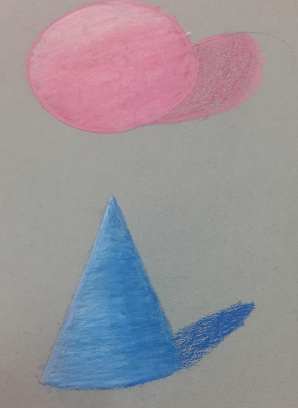
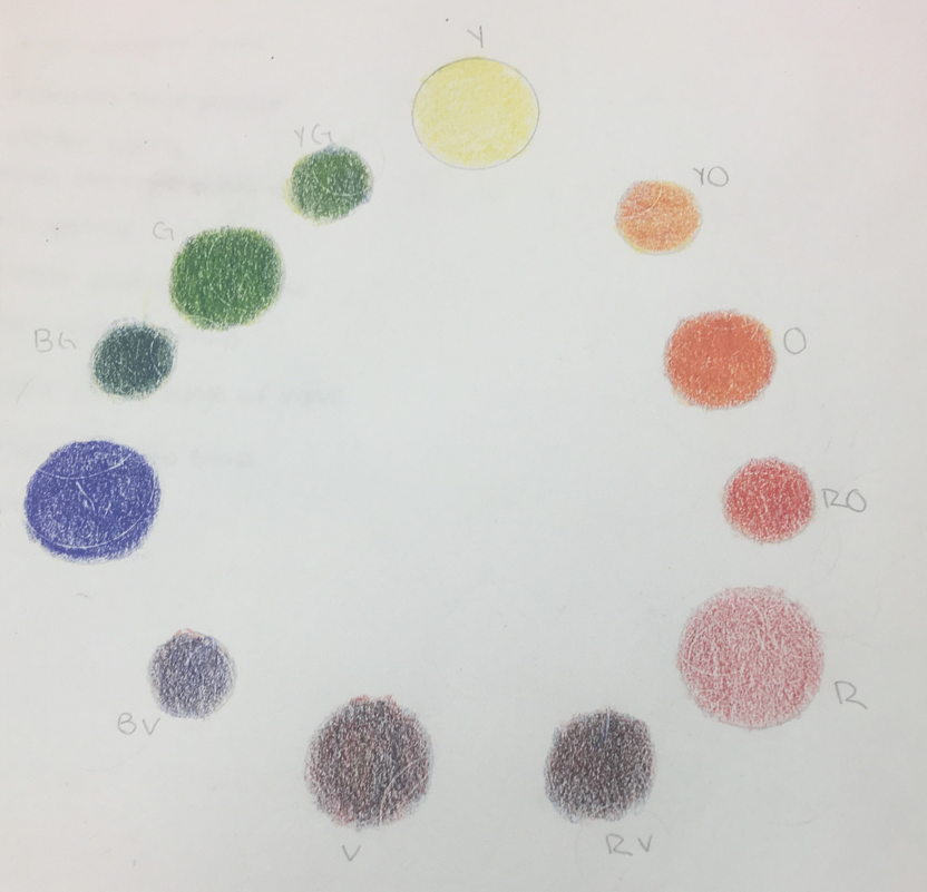
This assignment we used color pencils to make a color wheel and shapes. The hardest part for me had to be the shapes because of how we had to do the lightest part with the white.
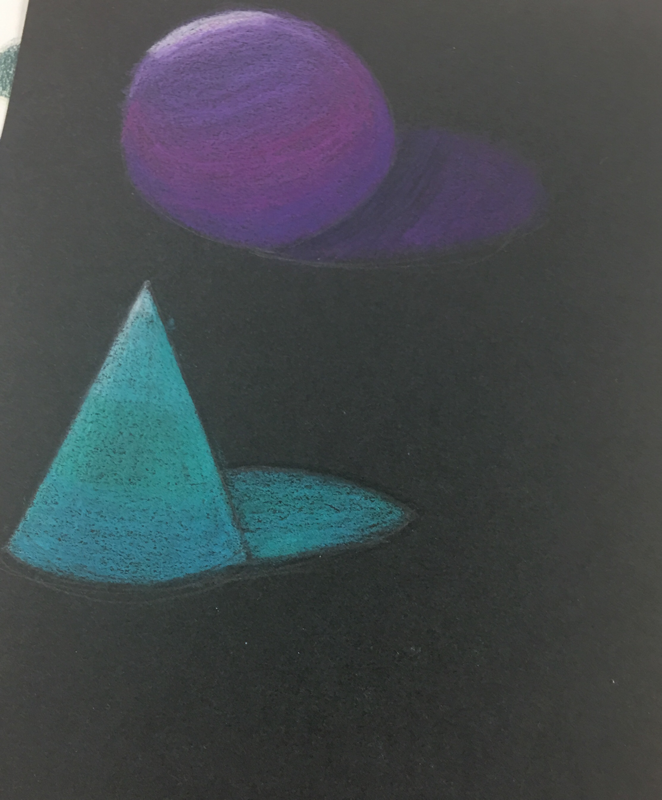
Acrylic value change and color wheel
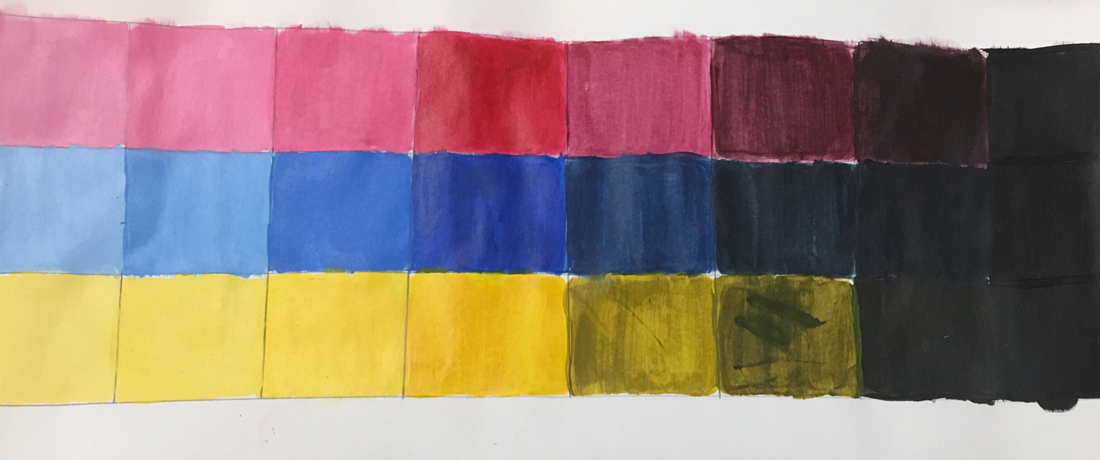
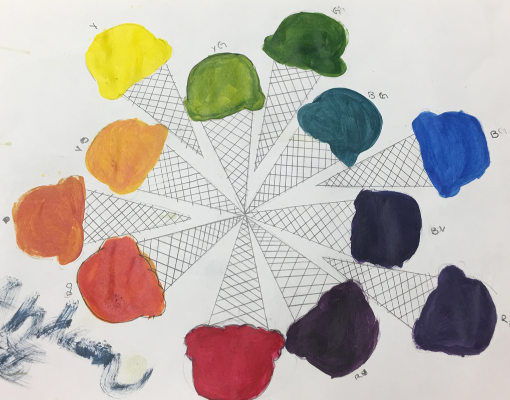
For this assignment we had to use the three primary colors of the color wheel. And go use white and black to go from lightest to darkest. It was a bit hard because we had to be careful on not adding to much dark. For the color wheel we had to use the primary colors and come up with a creative idea on what to put our colors on I did an ice cream because I can have ice cream every single day.
Clay
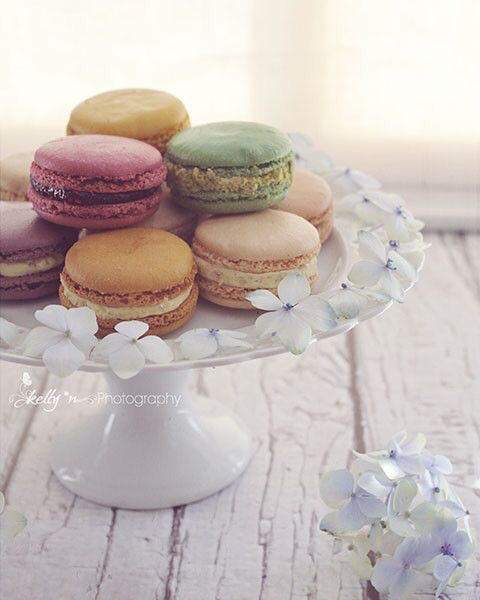
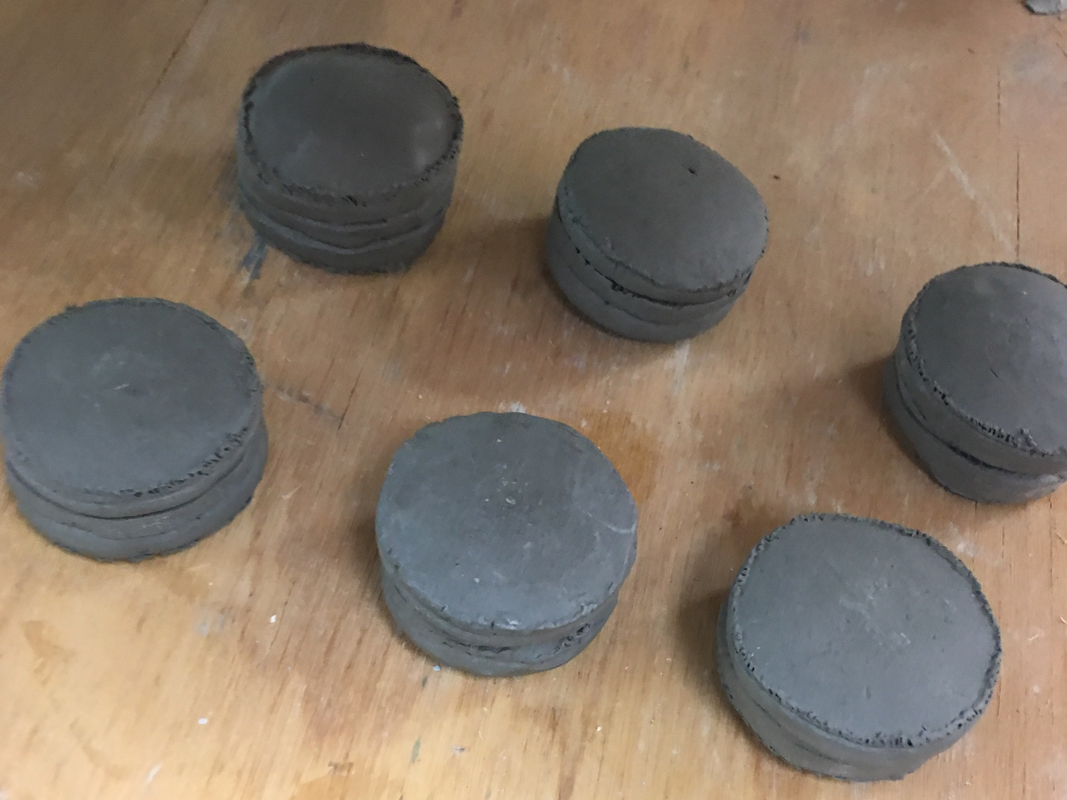

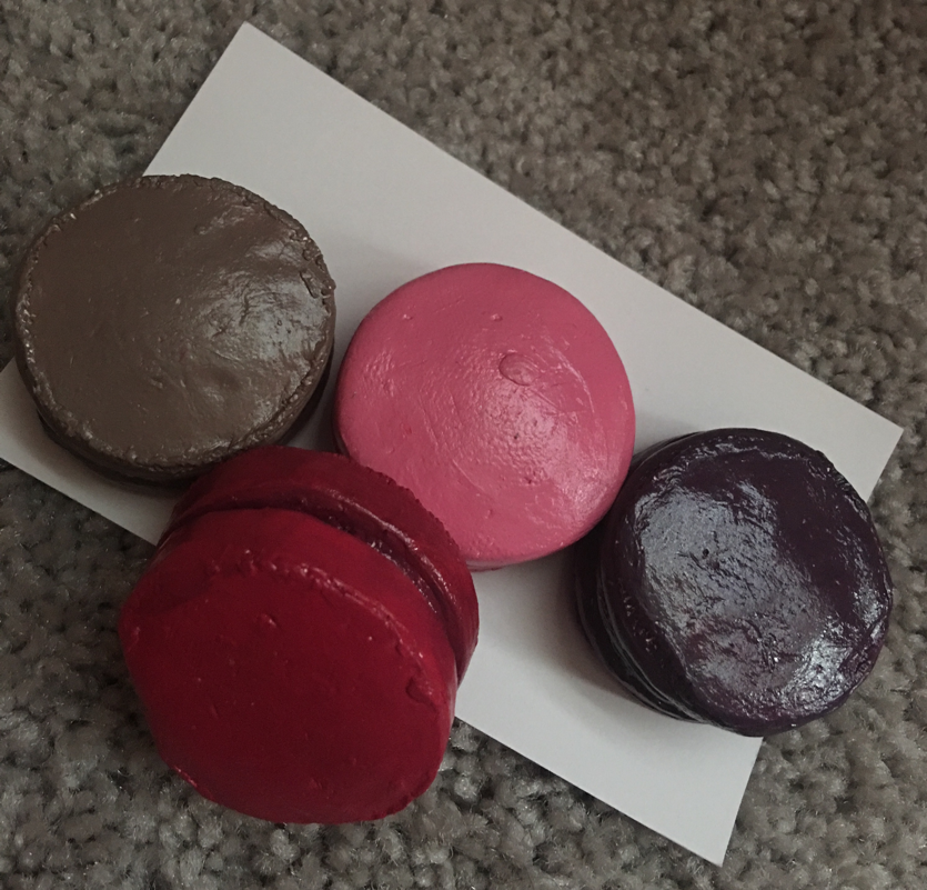
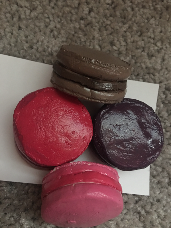
For this project we did clay which we had to choose any type of food we were going to do because we could only do food. For this project I choosed French Macarons because I love this cookies and they are so good and easy to make too.
1. Describe the craftsmanship of your sculpture. (Is it neat and well executed?) I think my project was pretty neat and that the sculpting was pretty good because at the end they actually came out looking like actual macarons. And the colors did come out good.
2. What was the most difficult part of this project?
The most difficult part about this project had to be the idea of coming up with a food to make. And actually making it look like that food and knowing how you were going to sculpt the piece of art.
3. Did your color choices work together harmoniously?
Yea I feel like my color choices did come out good because I made different color like for example I did chocolate and mint which I feel like they came out good and the colors are not to bright nor dark.
4. Is your sculpture interesting from all views?
I would have to say a maybe to this question but I could have done way much better at this to make it look interesting and for it to be a really good project.
5. Describe the differences in constructing a sculpture and doing something 2D.
How I was able to make this project to come out looking 2D took me a pretty long time to make it look good but I just rolled it up into a ball of clay and went from there.
6. How did you create textures in your sculpture?
I created texture in my art sculpture by adding texture to the end of the macarons all around the tip and making the top fluffy and soft.
7. Does your sculpture look like the actual food? How did you accomplish this?
Yes I feel like I was able to make it look like an actual cookie. I feel like I was able to do this because of all the tools I was able to use and by looking back at my reference photos.
8. What would you do differently if you were to do this project again?
If i had the opportunity to do this project all over again I would do a new food idea that would have more texture and detail to it.
Choosen artist
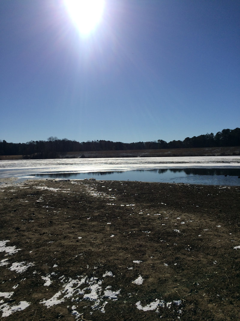
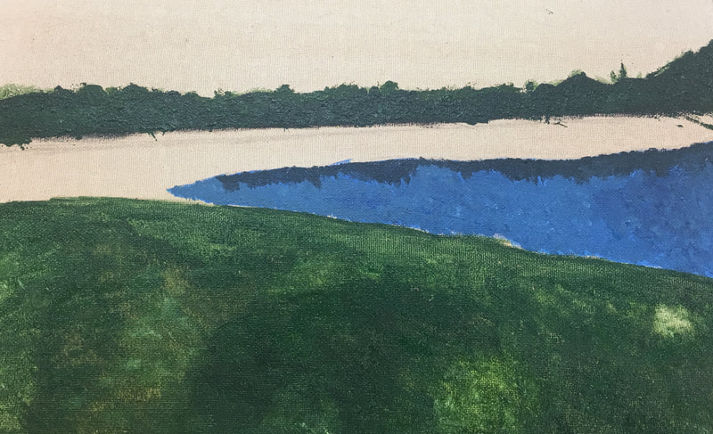
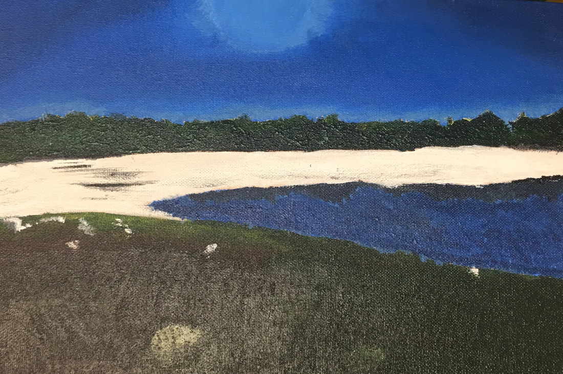
For this assignment we had to choose two artists and write a paper on them and then do a painting like there style. The hardest part about this project had to be the grass because it had snow and I cannot do snow it just looked like a blob of white paint. But then I blended it in and it came out looking pretty good.
1.Who was your referenced artist for the painting? Name 4 main ideas you used from your research to create your painting.
My reference artist for this painting was Caspar David Friedrich.
Name-
1.his idea of dark gloomy colors.
2.how he always uses water and a background of trees or mountains.
3.his style of use with the paint.
4.and how he works more with nature and landscape.
2. Describe the craftsmanship of your painting. (Is it neat and well executed?)
I put in a lot of time in this painting because I stared of doing the middle part and then the bottom and so on but what took me the most time to do was the grass. I think it was neat and well done because when I looked at the actual picture they almost came out looking alike.
3. What was the most difficult part of this project?
The most difficult part about this project had to be the grass and the snow because I had to but some snow in the grass but when I did that it looked like a blob of white paint and the color of the grass was pretty difficult because it was mixed with a dark brown and a dark green. And also the painting came out look to flat and not good.
4. Describe your color choices and how they reflect the work of your chosen artist?
My choice of colors I did was based off of some of the colors my chosen artist uses in his paintings. And it actually looks like one of his paintings he did and he uses mainly the colors I used which was the primary colors.
5. Describe how the style of your landscape reflects your chosen artist.
The style my chosen artist does is a bit more of dark and gloomy colors. He like to do more paintings that have water and mountains and trees in the background. And my painting has a bit of gloomy colors and has water and a background with trees in the distance.
6. What do you think your chosen artist would say if he or she could see your painting today?
I think the artist would say it looked good but I should have added a bit of fog like he does in some of his pieces and and more value to it.
7. What would you do differently if you were to do this project again?
If I were to do this project I would try to do the grass and the snow look realistic and maybe do the sky bit lower but overall it came out pretty good.
Piece of painting

For this assignment we had to recreate the image we got mines was a bit hard because I had a lot of shapes and the most difficult this I had to face while doing this assignment was getting the proportion right and the colors. But the good thing was that my colors were pretty solid and not so bright. I feel like my painting came out looking like the actual one I had.
